3461 (2016)
Macon, Georgia, U.S.A.
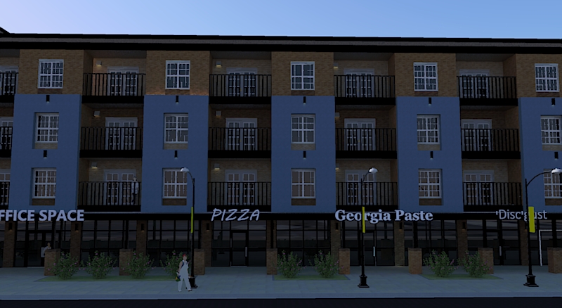
Commercial
This is a three story commercial plaza that caries at most two tenants per level. I used pink and green to show something new when it comes to moderate buildings. 3461 is given it's name by it's possible address number alongside Pio Nono Avenue. The building would replace a current commercial plaza that also has at most six tenant spaces. (Most of the names on the sign come from the businesses in the current plaza.)


The building has one elevator and one stairway. Only the first floor tenant spaces have emergency exit doors outside. The upper floors have back exits to a back hallway that takes them to the restrooms, elevator, and stairway. In the picture above this paragraph, The two door entrance leads to the staircase.

This is an amateur picture of how the new plaza would occupy the lot. Just by looking at the 'before' picture, you can tell that there's not much land. Well, 3461 would take up most the land, and like in the current plaza, there aren't a lot of parking spaces. The purpose isn't to attract more people, but re-style the building prototype.
A 360 degree video of the building. It's a very small basic building....

....Even if you look in the directory, you could tell building would be very novice. It would make little sense to get lost. On each level, at most two tenants to the left, a restroom, a stairway, an elevator. There are two maintenance closets, and also an elevator equipment closet. The red dots show exits, or entrances.

A site plan of 3461. This really is nothing big. I just wanted to take an average typical plaza, that anyone could just drive by and not really care for, and turn it into this 3 story indoor plaza.