Search This Blog

Monday, May 9, 2016

Microsoft Bottle


a bottle (2016)
Object, Miscellaneous


This is just a design of my reusable bottle that I did in Autodesk Maya. YES! My bottle really looks like this. The difference is that the top is broken. I designed how the bottle looked when it was first given to me. I also put water in it, just to make it more realistic. It's just a plain 'ole bottle with a 2010s Microsoft logo on it, nothing new.


History: I received this bottle at a concert at the Perimeter Mall back in 2014. You know, The one when the Microsoft store first opened, and everyone made a big party celebration out of it. The opening was so big, people were wearing t-shirts with Microsoft, the lines went all the way to the north wing of the building, there was a disc jockey, and this was actually one of the days my Subway employer wanted me to relax. The concert, itself, that evening, was when I got the bottle.

 Picture One

 Picture Two

Picture Three


This picture, above, is just the beginning design back when I first shaped up the bottle without the caps top. This was so easy, a low-budget animation studio could model this in an hour. It was everything afterward, which was hard.


Just so, no one thinks I'm playing games about this bottle story, I took a picture of my actual bottle. I still have the cap, but forgot to put the cap on the top. On the other hand, you would know how the cap and everything would look on the bottle. I also filled it with water(that I didn't waste, I swear), just to show the comparison to the 3D model.

"Model the Bottle"


Thursday, May 5, 2016

Pio Nono Plaza


Pio Nono Plaza Center (2016)
South Macon, Georgia, U.S.A.
Mixed-Use, Media, Conference, Office etc.

Pio Nono Plaza Center is a huge redesign that is done in a 15-story tower. The original building is just your average everyday lower-class shopping center, which has a Pawn shop, small markets, beauty shops, and things of that nature. If this were a real plan, I would hope that the current tenants occupy the space in the new building because it would be interesting to still have the same businesses but in a different environment. Inside this building are commercial businesses, studio apartments, a media center, office space, and conference space.
If this were a real project, This would be one of Macon's tallest buildings, as a matter of fact, this would be the largest building in it's neighborhood. The green metal cladding makes the building stand out.  The building is alongside a five store parking deck, which could vary due to inconvenient issues. The style of the building would be pretty foreign to the neighborhood, which is why I chose the location. 
Personal Touch: My childhood came up in this part of town and being in the metro-Atlanta environment, I wanted to bring something back with me, but somewhere one wouldn't guess. Rocky Creek/Pio Nono location is not really known for any glory, and some cases was in pretty bad shape, especially after Mothers Day Tornado in 2008. My goal is to 'Perimeter Center-ize' the neighborhood, or for a formal term, Update.


This is just a simple skyscraper. I used the round tactic that I did with Sierra, one of the earlier designs. I am fan of the curve horizontal faces style, and the last statement is just an opinion.


These are just regular images I did right off of SketchUp. I made a few adjustments so they would look more decent. The top left is the front entrance where the possible anchor would be located, the top right is the top view of the roof all the way down towards Rocky Creek (I also added the antenna later on), the bottom left is just the rear of the building all the way down to the parking deck (somewhere around here could be the garbage dump), and the bottom right is just the logo. 


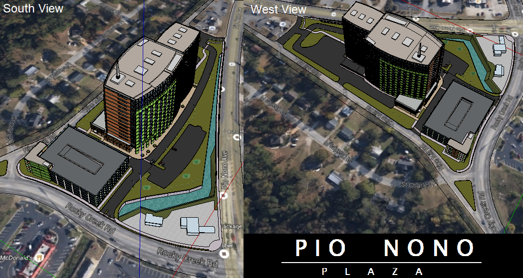
 I'm trying to make this clear as possible to locals. For those familiar, or who want to be familiar, with how this building would look, I took Birds-Eye camera shots like from the Sierra project. The small formal bank, north of the building, was ignored and untouched.


 As I mentioned earlier, The building is composed of commercial, residential, media center, conference rooms, and offices. There is also the parking deck. The image is facing West.


The directory goes from the first to the fifteenth floor(top left to bottom right). Some floors origins are structured alike so some of the floors have the same floor plan, so I did one plan for those floors. Few notes; The anchor is not publicly conjoined with the tenant spaces via inside. You would have to go back and forth into the shaders to go from anchor to tenants. There is an escalator from the first to the second floor. The elevator only goes to certain floors, for example one may only go to floors 1-6, while others can go to floors 1 and 7-12. Therefore use of the elevator can be fair and limited. There are five public elevators in the commercial zone, in the residential zone upward to the top, there are only four public elevators. My idea would be to follow a similar protocol that North Atlanta High School goes by with their elevators; They have a row of elevators and their's a pad of numbers you press on the outside that opens the elevators, however in NAHS, no buttons are in the elevators, but in this project the open/close would be an optional button in the elevator. The 15th floor has roof doors to the top of the roof like normal houses have to their attic, this could vary however. The stairway between the 6th and 7th floor shift directions.


A 360 degree view of the building. This is to show as much of the exterior as possible.


The Pio Nono Plaza Center wouldn't be the first idea on the block. Just up the road, I designed Seed of South Center from last year (2015). That year, I also designed one of those unique Dairy Queen buildings just across Pio Nono Avenue. Years ago, I designed a Publix right across Rocky Creek Road, and a Einstein Bagel Bros right nearby. So, K. Ammons Renderings and this area go way back!
The current shopping center on the lot is where Pio Nono Plaza got it's name from.

Tuesday, April 26, 2016

alleyway behind Lizzie's


alleyway behind Lizzie's (2016)
location undetermined
Fictional, 3D Personal Project, street scene


Just by looking at the picture above, you can tell this place is pretty dangerous to an average human being. Well, Behind a bar called 'Lizzies', there's been a lot of consequences to anyone who thinks they can come and take up charge. There've been incidents inside the bar, but behind the bar is where most the dirty business happens; people getting stabbed, people folded up and shoved inside of trashcans, vandalism, not to mention four people were decapitated at one time, and most of the evidence was cleaned up, with the exception of the remaining blood stains that still remain in front of the back door. All of this is made up, but of course it just explains how the scene is modeled the way it is.


Nothing in this picture but just a box wrap, another garbage can, and whatever. Some of the bricks are pretty long on this wall, especially. Also, The bars in the window are bent, and God knows what's going on inside, despite the light being on.


I designed this entire scene in Autodesk Maya. I also had to do compositing in Photoshop to combine textures to one another. The purpose was to just work on some typical late night scene in an alleyway.

"Wanna feel dizzy, Come to Lizzie's."


Wednesday, April 20, 2016

Bad Lust


Bad Lust (2016)
Sandy Springs, Georgia, U.S.A.
Mixed-Use, Studio Apartments

Bad Lust would be a bad idea to actually construct now. Let me state why, and why I'm bringing this subject up, first. One of the current buildings sitting in the place of Bad Lust is a brand new Burger King that was remodeled only a few years back. They tore down the original structure and designed this more fancy like one. I liked the new building, and did feel bad just a little bit that it would have to be demolished only after three years of standing. The reason of bringing this up first is, well, to honor the new style that was constructed, the new Bad Lust building would have the same material as the new Burger King; The red cladding, the dark with lines focal point, the tan cladding, and the gray sun setters, and also I put BK as one of the building anchors (Yeah, Just by looking at the logo you can tell)
Bad Lust would consist of no more than 42 or 41 studio apartments, and commercial tenants on the first level, including Burger King. This complex would have NO POOL, and Burger King would have NO DRIVE THRU for Eco-friendly reasons.


About the parking, There is at least one parking space per residential tenant, and a few more just incase. Commercial parking however is limited in space, unless there's an alternative. Another idea would be to park at the nearby City Walk Kroger nearby.


I used a unique lighting case on the building. It's gray, but I gave it pentagon like circular shape. And if you don't know what I'm talking about, Look at the gray objects on the dark lined material where Burger King is, there's one between each window on the third floor.


The 360 degree video should show enough of the complex. I took shots of close-up images of the tenant space so people could see those as well, and maybe pause if the video's going too fast.


FACT, Sandy Springs actually did plan the site design of Bad Lust. The image above shows the city's real revitalization plan. The exception is that the real plan was ONLY Retail, NOT Mixed-Use. (I circled the Bad Lust location in red)
The map was designed around 2012, and the plan to extinguish the current Burger King, and another occupant could actually happen since the city is trying to have a more downtown look along Roswell and the streets that go across it, but, major city projects differ as the city gets more advance into their plans. (On the map, look at the street where you see those two roundabouts and they diverge into two streets, That blue colored building in the middle, was changed into this performing arts theater etc.)

The purpose of the title 'Bad Lust' is to show how tempting lust is of the world, and how it can lead to evil, if not guilt.

Tuesday, April 12, 2016

PPG's Bedroom


PowerPuff Girls Bedroom (2016)
Central Townsville_fictional
Scenery, Cartoon, TV Show

Sugar, Spice, and everything nice; These were the ingredients to design a custom bedroom for the perfect little girls, but I accidentally added an extra ingredient to the poly meshes, Mia Material X...
....Thus the Powerpuff Girls bedroom is done! I probably could've did better, but my time was limited.
 I am still getting comfortable with the current 2016 series. Most of the new episodes, I've seen so far, aren't that bad. However, I decided to design this scene of the three girls bedroom in classic style, from the older series. [In the video above, I also used the classic logo and theme song instead of the new ones.]

If the video above doesn't work for your browser, click this link THIS LINK 


Forgive me if I left anything important out, I was able to design the hotline, the bed, the dresser drawers, the chest (with Octi), the stuffed dog and standing cat, the kiddie table, and a few drawings on the wall etc. The MOST IMPORTANT thing I remembered to design was the three circular holes of entrance and exit, as the shortcut that the three girls always take.


The table just has an orange juice bottle, crayons, and an unfinished drawing. I wanted the bed to be more accurate to the series, but The bed style varies from season to season. Overall, Buttercup sleeps on the left, and then it goes over to Bubble's on the right, while Blossom's in the middle.


So, I guess you wonder what awesome things Bubbles, Blossom, and Buttercup do when they're in their room. Look at this concept image from the series, and this is one of them.


Monday, April 11, 2016

3461


3461 (2016)
Macon, Georgia, U.S.A.
Commercial

This is a three story commercial plaza that caries at most two tenants per level. I used pink and green to show something new when it comes to moderate buildings. 3461 is given it's name by it's possible address number alongside Pio Nono Avenue. The building would replace a current commercial plaza that also has at most six tenant spaces. (Most of the names on the sign come from the businesses in the current plaza.)


The building has one elevator and one stairway. Only the first floor tenant spaces have emergency exit doors outside. The upper floors have back exits to a back hallway that takes them to the restrooms, elevator, and stairway. In the picture above this paragraph, The two door entrance leads to the staircase.

 
This is an amateur picture of how the new plaza would occupy the lot. Just by looking at the 'before' picture, you can tell that there's not much land. Well, 3461 would take up most the land, and like in the current plaza, there aren't a lot of parking spaces. The purpose isn't to attract more people, but re-style the building prototype.


A 360 degree video of the building. It's a very small basic building....
 

 ....Even if you look in the directory, you could tell building would be very novice. It would make little sense to get lost. On each level, at most two tenants to the left, a restroom, a stairway, an elevator. There are two maintenance closets, and also an elevator equipment closet. The red dots show exits, or entrances.


A site plan of 3461. This really is nothing big. I just wanted to take an average typical plaza, that anyone could just drive by and not really care for, and turn it into this 3 story indoor plaza.

Saturday, April 2, 2016

Peer Pressure


Peer Pressure (2016)
Downtown Macon, Georgia, U.S.A.
Mixed-Use Development

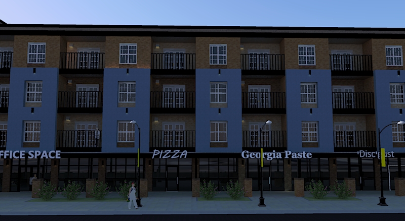
Peer Pressure is a combination of commercial tenants, possible office space, and studio apartments. There isn't to be much new about this with the exception of it standing out in the heart of Downtown Macon. The orange and blue is common in the city, especially since Central High's colors are orange and blue. The colors, however, are more desaturate. The building has four levels. The first level is the commercial tenant space. From the second level to the fourth level will be studio apartments. On each floor, All Studio Apartments are alike, excluding the ones on the upper end, which have a washer and dryer lounge, while other apartment tenants would need to use the laundry room on the possible second level. The third level above the laundry room, would be the administration for the entire building. The fourth would be the fitness center. Next to the tenants on the first floor, there is an indoor pool hall. The building consist of two elevators, and two stairways. Each level has two exits directly to the parking deck, except the fourth level. The parking deck rises until it reaches the third level. The parking deck has two entrances/exits. The garbage disposal is in the upper end.

 
As you can see, The commercial tenants on the first floor, and the residential tenants on the second floor to the fourth floor. Each studio apartment has a balcony. There are seven apartments per floor.
  
 
This video shows a 360 degree view of the building.
 

This is an inside directory of the building. This could vary if really existed.
 
 
For those familiar with the Macon area, The building sits between Second street and Pine street. Peer Pressure is just a positive inspiration towards the city.